Search This Blog

Showing posts with label pearls. Show all posts

Wednesday, September 4, 2013

card + a secret


Good morning friends! Hope the start to your September has been good so far! I can't complain too much except that the next 2 weeks are going to kind of suck schedule wise, I will be working more hours than normal while one of the other managers at the store is on vacation. Which, in the end means more $ for me but it doesn't leave me alot of scrapping or fun time. So I have been trying to get ahead of the game and do all the projects I have due for September, including some challenges that I'd like to compete in. I meant to get going on them yesterday while I was off, but I was messing around with the look of my blog. I only meant to change the background and then I accidently deleted a whole bunch of stuff and had to spend 2 hours starting from scratch again so it wouldn't look weird! Well, for now it looks better I think it's not totally perfect and I will be adding stuff as I go, but for now it's a new look?!! What do you think?


So Frosted Designs new scrapbooking kit and supplies store opens in 2 DAYS!!! I am so excited to still be part of this team and be able to share some inspiration for all of the great new products we will be carrying. If you haven't already, please follow Frosted Designs on facebook and stay tuned to the BLOG for the launch of the new store in just a few days! The Design team has lots of fun challenges planned and we will be sharing up lots of inspiration for you every single day!!

Ok, so isn't that exciting? In the midst of all these changes, I was able to throw together a quick birthday card for my stepmom who's bday was August 27th and get it off into the mail to her along with a jar of my very first batch of homemade pear butter :) I hope she and my dad enjoy it! 


I had all these scraps from one of my favorite Authentique lines, and I knew I had been saving them for something special. I just love the color scheme, all I did was paste them around the card covering the blank white, then put large pearls for the flower centers. I also cut out another piece of yellow patterned paper that I stamped and inked and then pop dotted up. Under that I put a scrap of fabric, a vintage button, mini wood veneer camera, and a paper rose. I misted lightly over this and then started the inside with a bit of stamping and the back with paper and mist. All total, it probably took me about 20 minutes to make.


Well that is all for today. Check back in with me in a few days for more inspiration... Tim's Tag for September, more CSI case files, and of course new challenges for Frosted Designs!! Can't wait to share again:) Until next time scrappy friends~VV


Saturday, December 15, 2012

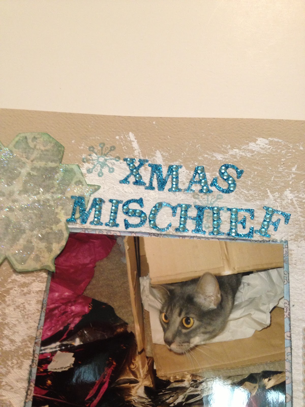
Xmas Mischief: Dec Sketch Challenge at SF!

Hi everyone! Just a quick post today to share of a layout I did for my LSS, Scrapping Frenzy, for our monthly sketch challenge. I don't have a pic of the sketch, but basically I turned in on it's side a flipped it a bit. I really enjoyed working with these new Pink Paislee papers, I chose the lighter blue and beige side of the one paper and some solid cardstock as my background. I had fun trying to make a 'snowy' background for these pictures of our beloved Carmella, digging thru the wrapping paper pile on Christmas morning. Forgive these photos, I had to take them inside that day since it was so wet and dreary out :) 
Here are some pics:


 I fussy cut some snowflakes from a scrap of christmas paper, then I glittered them and stickled some of them and used pop dots to pop them off my page. I had a tag from We R Memory Keepers that I tied with some ribbon and added to the page too. I inked it first with Colorbox chalk ink in mint and then outlined it with silver stickles. I also chose a few vintage buttons to add for dimension. For the patterned paper by Pink Paislee, I distressed the edged and used metallic blue Martha Stewart stackable ink for the edges. I also lightly spritzed it with Smooch Spritz in silver foil for a pretty shimmer.
 I added some rows of pearls and a few of my fellow DT member Laura's 'fork tie bows' 
in silver for a sweet touch. 


 The journaling tag is from the Authentique peaceful collection sticker elements sheet. I have so very few of them left... I love that paper line I might just have to buy some more!!! 
Ok, well that's it for today! Short and sweet! If you'd like to see my other design team member's take on the sketch of the month, head on over to www.scrappingfrenzy.com and check it out! Until next time, Peace Y'all~VV

Monday, November 12, 2012

'memories' auction layout using Crate Paper

This is a layout that for Scrapping Frenzy convention that was put up for auction for the weekend. I really loved the papers and colors I used for a super vintage look. I think they are Crate Paper. So whoever won the auction is one luck gal with this one! I did a lot of embellishing of course!! Sorry for the pics...I took them under fluorescent lights at the convention, and they didn't rotate either!! 
(apologize in advance for your neck problems!)


 A few close ups of the little clusters I did. Combining wooden buttons, flowers, pearls and bling as well as some Purple Pumpkin goodies!


that's it for today! Hope you enjoyed my share and your weekend! It's the start to another week and one day closer to Thanksgiving :) my favorite holiday because of the yummy food!! until next time friends, peace y'all~ VV

Sunday, November 4, 2012

{QUENCH} @ the I.P.

Hi friends! I feel like I have been on hiatus for entirely too long...well no actually I have just been really busy! Started my sabbatical from work on Oct 14, got married on Oct 19, went to Costa Rica for our honeymoon on Oct 27 and we just got back yesterday!!! So there are LOTSSS more pics and layouts and posts to share for the next few months... I will be attempting to start scrapping all these photos as well as make lots of  crafty/photo gifts for family for the holidays! So it's gonna be crazy around here, but the good kind of crazy- the creative kind! I am even going to start posting on my fb page a few items I will be selling for the holidays, so stay tuned for that! I am so excited things will kind of be 'back to normal' except that.... I am now Mrs. James L. Hollister!!!!! :) soooo happy:))

Ok. so enough newlywed mushy stuff. I was able to do 3 layouts last week after the wedding and this is the first one I will share up today. These photos are from my scrapping girls weekend in Biloxi, MS with 2 of my very favorite ladies...Carmen and Leanne. We went to an all weekend crop retreat and spent the next day at the spa and pool all day at the casino...it was fabulous!!! Here's my layout:


 Here is another photo of the whole thing:


A close up of one of the clusters. I used one of the Tim Holtz fragments that Monica and I made/ played with at convention. They are so fun to make, will have to share up a tutorial on how to make those on here soon maybe...or maybe we'll have a class on them at Scrapping Frenzy! Also I used a large yellow fabric rose, some raffia ribbon underneath, tickets, paper flowers and a button and resin rose.


I don't know why but I have this thing with taking pictures of my feet lately :) lol
  And for my journaling, i used a basic shipping tag that i inked and then tied a bit of teal colored tulle on.

A close up of the stamping near my title and the cool fiber piece i used to underline it.

 Ok, well that is all for today, short and sweet! Stop back in tomorrow for another fun layout and keep checking in with me this month as I share up new projects, layouts, and handmade items I will be selling for the holidays on my fb page...thanks friends! Until next time, Peace Y'all~ VV

Supplies Used:
royal blue wave paper- Basic Grey 'lime rickey'
teal/white polka dot paper-unknown from stash
yellow cardstock- Bazzil
Smooch Spritz in 'river mossy'
raffia ribbon
paper/felt flowers, mini pearls and bling- Michael's
yellow tickets- Purple Pumpkin
Thickers- Amy Tangerine "Goodness"
Tim Holtz paper distresser
Tim Holtz distress marker- bundled sage
manila shipping tag- The Paper Studio
Colorbox chalk ink-mint
light colored teal tulle
Tim Holtz 'fragments'- decorated @ SF covention


Thursday, August 23, 2012

{Star Quality} with BG 'Out of Print'


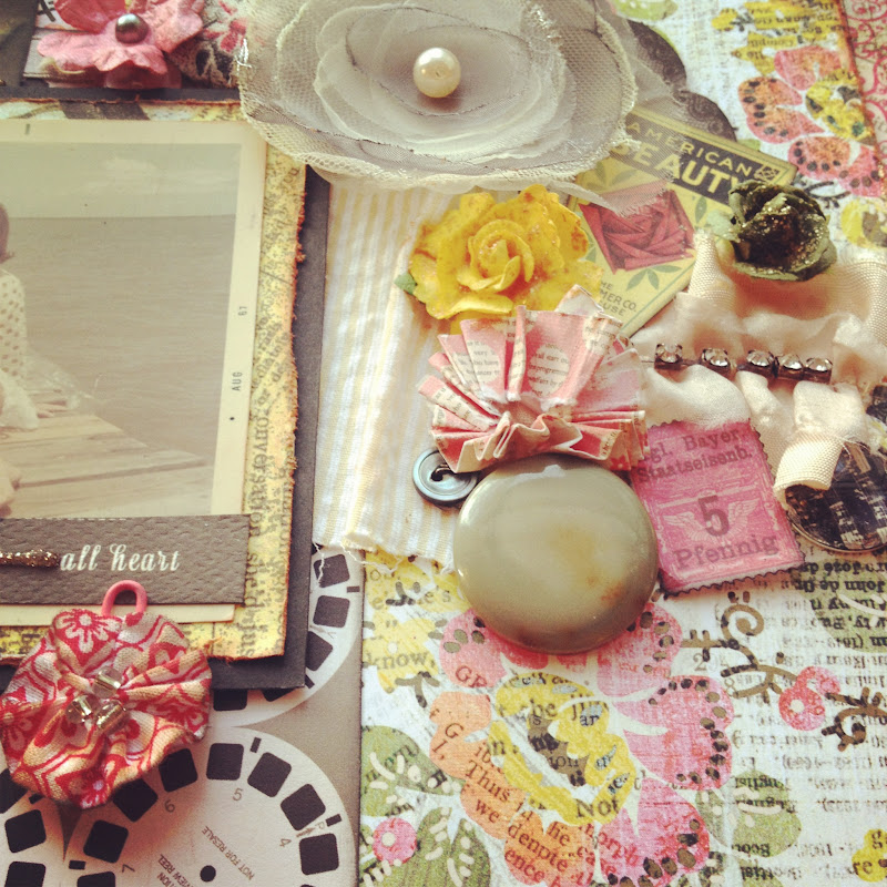
Hi everyone! I am here today to share a very special layout I did this month using one of my favorite paper lines, Basic Grey, the 'Out of Print' collection. This is my last post this month for my LSS, Scrapping Frenzy. I think the name of this line is really very fitting since I swear I own probably every sheet in double but I can't seem to get enough of it when I see it I always buy more! LOL! So now you know why it's called 'out of print'!! Another special thing about this layout is that I used a very old photo of my Meemaw sitting on Orange Street pier in Fairhope, Alabama. I love this photo and the expression on her face, even though I didn't know her back then it really shows her grace and personality!! I knew it would be perfect for the type of layout I was wanting to do. So, here's a peek of the whole thing:

 To start the layering under my photo, I first matted it with one side of the BG paper and distressed the edges, then inked that. Under that I layered a piece of black cardstock to make the photo 'pop' off the page. I didn't want alot of dark colors going on but I knew I would have to tie in the black somehow into other elements of the page so I used a black paper flower, the black cut out words from the Carte Bella paper, and the black also came in on the Echo park paper with the film reels.

This photo was a sneaky-peek I took with instagram! I love that app, just need a figure out a cheap way to order some of my prints from them that will be printed square!!

I would have to say my favorite thing about scrapping is 'building' my cluster, to me it's the best part about working on a page, digging through your stash and combining just the perfect mix of embellishments to get the look you want. For this cluster, I started off with a grey tulle flower from Webster's pages 'Florettes' then I added some color- drawing most of my color scheme from the flower paper behind the cluster. I used the yellow, pink, and pale green to complement the grey flower and off course topped it off with some stickles and pearls! My fav :D !!

For the title, I used some Tim Holtz type-writer looking salvage stickers to add to the vintage look. I underlined each one with stickles in 'platinum'.


And this is my favorite shot! The light was really great in the window when I snapped this one :)

 Well, that is all for today. If you don't already have this line, Basic Grey 'Out of Print' stop by the store today and get some! It is really so versatile and by far probably one of my favorite paper collections. Until next time my scrappy gal pals~ Peace Y'all~VV

Supplies used: Basic Grey 'Out of Print'- storyteller and , Echo Park 'Note to Self' 6x6 papers, Black cardstock by Bazzil, Colorbox pigment inks in blush, lipstick, and black. Smooch Spritz in 'Pralines and Cream', Tim Holtz distress stickles- 'dried marigold' and 'scattered straw' also Glitz stickles in 'platinum'. Webster's pages Florettes-grey tulle flower, Queen &Co twine-brown/white and yellow/white. Carte Bella 'life is beautiful' word sentiments. Crate paper cardstock cutouts-American Beauty and stamp, Sticky Thumb pop dots, paper flowers/roses- Prima and Recollections, pearls-Michael's, vintage buttons, rhinestone ruffle- Prima, Tim Holtz salvage stickers 'crowded attic'. Pier 1 paperclip flower, vintage buttons, cardboard piece and fabric from my stash.


Sunday, July 15, 2012

{Inner Beauty} July Sketch at HBS

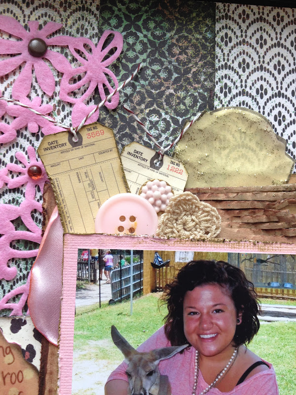
Good afternoon friends! I am here today to share another non-DT layout I did late last night, I had caught the creative bug after going to our meeting at my LSS, Scrapping Frenzy. We were supposed to crop afterwards but everyone was pretty tired except me! So I came home and unpacked and got organized for my next few weeks of submissions, and decided to finish the LO that I started at the store. I am really, really happy with the way it turned out. I was inspired once again by a fellow DT member, Suzanne, who is the master of layering on her LO's!!! She puts everything under the sun on her pages...lace, freezer paper, cardboard, burlap, cheesecloth...LOL! Well I went digging through my stash and found a few things to layer, and I really wanted to brighten up this green/brown/black paper so I added some pinks in, to tye in my photo of my cousin Kate. I used the July Sketch that's up over at Handmade by Suzanne, my first submission for their challenges, but the winner gets a $40 voucher!! WHOO HOO!! Let's hope I win, there are sooo many awesome pages in their gallery!! Here is the sketch:

And this is how my LO turned out:


I decided to try my hand at a little layering of materials again. I used cardboard, several patterned papers, a shipping tag, a felt border, some satin material from a flower I took apart, buttons, and of course other yummy stuff. I have been holding onto some of these Basic Grey papers for a while, and I liked mixing them together, but I wanted to tie in the pink like her shirt in the photo, so I added the border and went from there! I really like how the unexpected color palette of browns, greens, blacks and cream mix with the light pinks! Perfect for the photo :D Here are a few close ups:


So that's all for me today. I hope you had a great weekend... I had to work but I also got a free day and was able to fit in a little 'relaxtion' time with friends which is always good for the soul, so I'm feeling great heading into the start of this week! I'll be back again soon to share another sketch challenge and maybe a wedding craft or two :D Until next time, Peace y'all~VV

Supplies Used:
pink cardstock-Bazzil
Echo Park 6x6 mini papers 'Note to Self'
leopard print paper- The Paper Studio
Basic Grey- Ambrosia 'Quince'
Basic Grey-Out of Print 'Odds 'n Ends'
pink felt flower border- Queen & Co
manila shipping tag
brown baker's twine- Queen & Co
pink and gold pearls- Michael's
Thicker's brown foam alphas
dew drops by The Robin's Nest
small circle, resin embellishment, silk piece, cardboard, vintage buttons, flowers, and brads- mystash
fabric button- Purple Pumpkin Crafts
Ranger Stickles in gold
Tim Holtz distress stickles - peeled paint
Colorbox cat's eye inks in chestnut, dark brown, black, and dark moss
Smooch Spritz by Clearsnap in 'emerald sprinkle'
brown ZIG marker
Tim Holtz distress marker in 'picket fence'


Tuesday, March 27, 2012

DIY bouquet charms & a PP sketch challenge!


WARNING: PHOTO-HEAVY POST AHEAD!!

Good evening, everyone! I feel like I have really been out of the loop this month with everyone and everything out there in crafty blog land. That's mostly because I have gone to working 6-day work weeks during prom season. I still have a little less than 3 weeks to go, and although I love what I do, I'm starting to get a little burnt out. I just really need those 2 days a week to do errands, keep my house clean, grocery shop, pay bills,  not to mention have some me time and down time and fun time. I know I've got to keep pushing through and it's only gonna get worse if I don't make the best of it, so that's what I'm trying to do right now. Today was my first day off since last Sunday and I was able to get a lil' crafty time in. I also got to eat lunch at one of my fav restaurants- California Dreaming, and I finally got a new phone!! An iPhone 4S. Super excited about it....been wanting one for a while and finally broke down and spent the money to get one. I know it will be worth it though, in the long run of planning this wedding, J and I are going to need these phones!!!

Alright, enough of my babbling on. A few weeks back I decided to tackle one of the crafts I wanted to make for the wedding day, DIY bouquet charms. I have seen a few different versions, mostly here . I was inspired my Mrs.Crab Cake over at the Hive. I have seen other ones, but I thought taking this idea I could make another version similar to it and get the same effect. Overall I'm really happy with how they turned out, even though they show a few imperfections I think I will probably not re-do them because everyone I have asked says that they show 'character' and it makes them look old, which is kind of what I was going for- vintage, right?? So without further ado- here is my complete tutorial:

1. The first thing you should do is select your photos. I used head shots from a few old pictures that I happened to have in a large bin of old family photos and had them re touched at a kiosk at  Walmart. This was the simplest way for me, however if you're photo shop wiz which I am not, you could certainly do them yourself and print at home on photo paper. At the kiosk, I retouched them and printed them all in wallet size for the purpose of the size of the charms and also they were all changed over to 'sepia' which I liked more than the black and white option. 
 2. The second step is to cut all your photos down to size, the easiest method to do this is to measure using the glass scrabble tiles/ jewelry findings or whatever you are using for your backings and trim it down from there if you have to. For mine, I made 2 larger circle ones and 4 smaller rounded squares, basically 2 sets because I wanted to give one set to my sister. For the squares, I cut them down as close to size as I could and used a corner rounder to give them that rounded edge. Even on a small scale, I think it worked pretty well! 

 Here is a close up on one side of the circle ones- 


 And the other side of the circle charms- backed with glass so I used 2 photos back to back that I double sided and taped together.

And here is a closie of the rounded square ones, not perfectly matched but I LOVE these!

 3. Next, to add dimension to them, I decided to put a slate blue mini pearl on each one. None of the examples I saw had these, but for some reason I just thought it made them look more 'bridal'. I tried to stick them each in the same spot so they would all be uniform.  I didn't take a photo here of the circle one, but i added a larger pearl to it as well. 
 4. The last step in my opinion, is the hardest. I used glossy accents or 'liquid glass' as some of you call it to cover over the entire charm. I was very careful in the beginning to do an even coat and make sure bubbles were popped, but I found that hard to do since I wasn't sitting there watching them dry. I even dried one coat with my heat tool and then did another coat to make it a little thicker and there were still tiny bubbles. Obviously if you were using glass scrabble tiles in this step that would be avoided, but I already had the liquid glass on hand and I was trying to buy as little as possible for this project. 
 Here is a close up of them before they were dry. As you can see here it looks like most of the bubbles were gone, but they will still pop up over the drying period. So annoying! Although, everyone in my family that I have showed them to says that makes them look vintage and old and have character, so I guess I'm cool with it! LOL!
5. The last thing you have to do of course is find the type of ribbon you want to tie them to your bouquet with, I was able to find this super cute velvet ribbon in the 'malibu' color for my wedding, and it worked perfectly as far as the thickness I needed. Here are a few close ups of what they turned out like!! Voila:


  Ok, so the last thing I will share with you tonite is a quick little LO I did at the last minute to get in on the sketch challenge over at Purple Pumpkin Crafts.  I absolutely LOVE their handmade embellishments and their March Sale is actually tonite, about 3:30am Central Standard time...if I didn't have work so early in the am I would be getting up at that crazy hour to make an order. I still have quite a stash from the last one and I need to really get in my crafts room and organize....ahh another day. There's alot of stuff in there that I forgot that I have, don't you love when that happens?? Ok, so here was the sketch we were supposed to use:


I apologize for these photos, some of the first ones I've taken with my iPhone  today and I can't figure out how to rotate these, so this will have to do for now!! 


 Ok folks, that's about it for me tonite. Thank you once again for stopping by and I promise I will be leaving some comments on all your blogs very, very soon. Feels great though to have another LO out in the world... I am on my way to making a facebook page all about scrapbook consulting, technique teaching, and maybe even doing personalized books for anyone if they are interested. We'll see how it goes...def not my full time job right now but I would LOVE if it was. Good night, and PEACE Y'ALL~ VV

Supplies List:
Bouquet Charms:
The Jewelry Shoppe findings- Hobby Lobby -
 18mm square stamping blanks x 4
1 1/4 round frames w/ glass x 2
steele blue stick on mini pearls- Michael's
Tim Holtz distress ink in Vintage Photo
corner rounder
fine tipped scissors
Glossy Accents 'liquid glass'
double sided tape
ribbon of choice

Layout:
background paper- unknown from stash
12 x12 sheet used for scalloped square- Bo Bunny 'Ad Libs Verbiage' #12
My Mind's Eye- 'Stella Rose' collection title words - 'Mabel So Sweet'
Recollections Signature floral embellishments- browns
teal and dark brown cardstock from stash
fabric covered buttons- Purple Pumpkin Crafts
yellow stickles
Smooch Spritz in gold glow
Tim Holtz distress ink in Tea Dye
dark brown cat eye- Colorbox
Tim Holtz paper distressing tool
The Jewelry Shoppe- 2.5mm flower cabochans
fabric pieces- straps from an old sundress (bought @ Buffalo Exchange in Portland, OR)
stick on pearls in white, dark brown, and dark teal- Micheal's
brown Zig marker
pop dots