Hi everyone! I am here today to share a very special layout I did this month using one of my favorite paper lines, Basic Grey, the 'Out of Print' collection. This is my last post this month for my LSS, Scrapping Frenzy. I think the name of this line is really very fitting since I swear I own probably every sheet in double but I can't seem to get enough of it when I see it I always buy more! LOL! So now you know why it's called 'out of print'!! Another special thing about this layout is that I used a very old photo of my Meemaw sitting on Orange Street pier in Fairhope, Alabama. I love this photo and the expression on her face, even though I didn't know her back then it really shows her grace and personality!! I knew it would be perfect for the type of layout I was wanting to do. So, here's a peek of the whole thing:


To start the layering under my photo, I first matted it with one side of the BG paper and distressed the edges, then inked that. Under that I layered a piece of black cardstock to make the photo 'pop' off the page. I didn't want alot of dark colors going on but I knew I would have to tie in the black somehow into other elements of the page so I used a black paper flower, the black cut out words from the Carte Bella paper, and the black also came in on the Echo park paper with the film reels.

This photo was a sneaky-peek I took with instagram! I love that app, just need a figure out a cheap way to order some of my prints from them that will be printed square!!
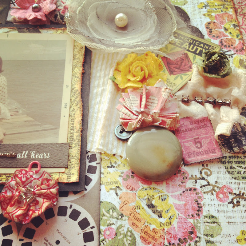
I would have to say my favorite thing about scrapping is 'building' my cluster, to me it's the best part about working on a page, digging through your stash and combining just the perfect mix of embellishments to get the look you want. For this cluster, I started off with a grey tulle flower from Webster's pages 'Florettes' then I added some color- drawing most of my color scheme from the flower paper behind the cluster. I used the yellow, pink, and pale green to complement the grey flower and off course topped it off with some stickles and pearls! My fav :D !!

For the title, I used some Tim Holtz type-writer looking salvage stickers to add to the vintage look. I underlined each one with stickles in 'platinum'.


And this is my favorite shot! The light was really great in the window when I snapped this one :)

Well, that is all for today. If you don't already have this line, Basic Grey 'Out of Print' stop by the store today and get some! It is really so versatile and by far probably one of my favorite paper collections. Until next time my scrappy gal pals~ Peace Y'all~VV
Supplies used: Basic Grey 'Out of Print'- storyteller and , Echo Park 'Note to Self' 6x6 papers, Black cardstock by Bazzil, Colorbox pigment inks in blush, lipstick, and black. Smooch Spritz in 'Pralines and Cream', Tim Holtz distress stickles- 'dried marigold' and 'scattered straw' also Glitz stickles in 'platinum'. Webster's pages Florettes-grey tulle flower, Queen &Co twine-brown/white and yellow/white. Carte Bella 'life is beautiful' word sentiments. Crate paper cardstock cutouts-American Beauty and stamp, Sticky Thumb pop dots, paper flowers/roses- Prima and Recollections, pearls-Michael's, vintage buttons, rhinestone ruffle- Prima, Tim Holtz salvage stickers 'crowded attic'. Pier 1 paperclip flower, vintage buttons, cardboard piece and fabric from my stash.
I don't know if I ever saw this picture of her before - I love it! So fitting =)
ReplyDelete